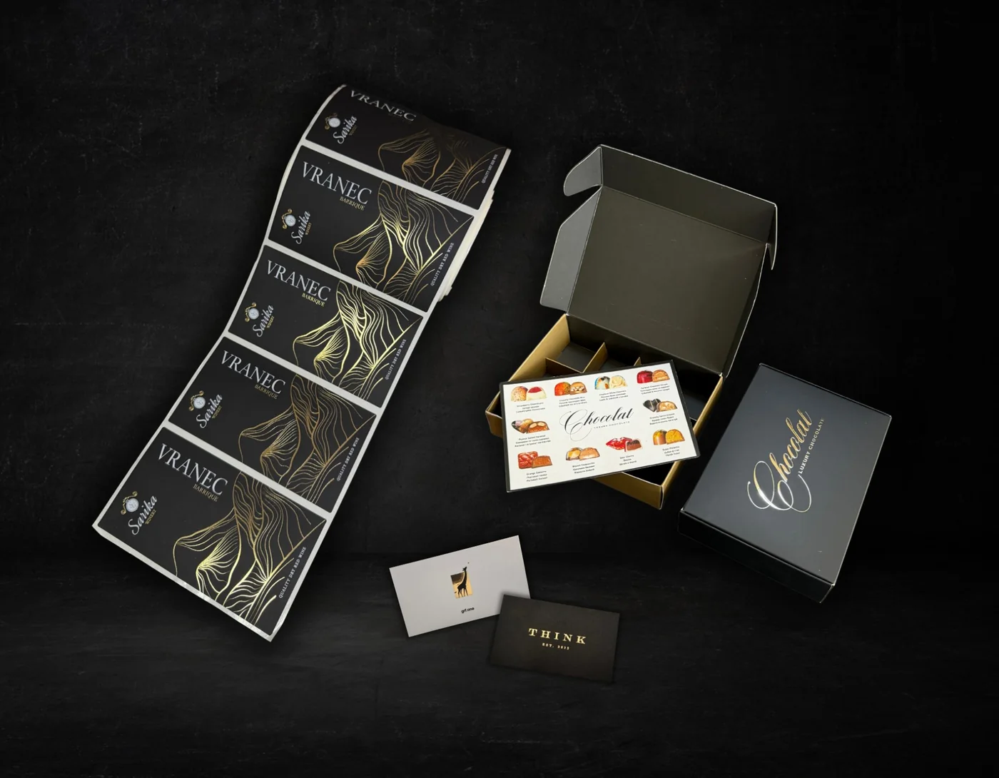
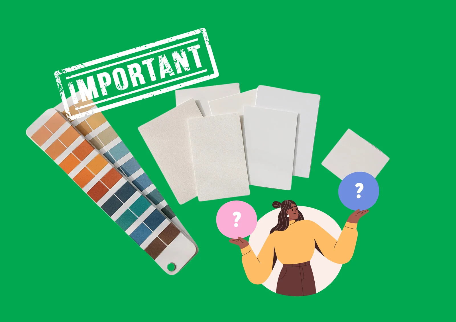
When we think about printed materials, we usually focus on the design, the colours and the content. But there is another element that often goes unnoticed, yet has a huge influence on how customers perceive your brand – the paper.
Its thickness, texture and finish are not just technical specifications. They send a message about the quality, value and professionalism of your product before anyone has read a single word.
First impressions start with touch
Imagine two identical business cards with the same design, colours and information. One is printed on thin paper, the other on a heavier stock with matt lamination.
The design is the same, but the impression is not.
The thickness, rigidity and surface of the material affect how the product looks and how it feels in the hand. That is exactly why the right choice of paper can significantly increase the perceived value of a printed product.
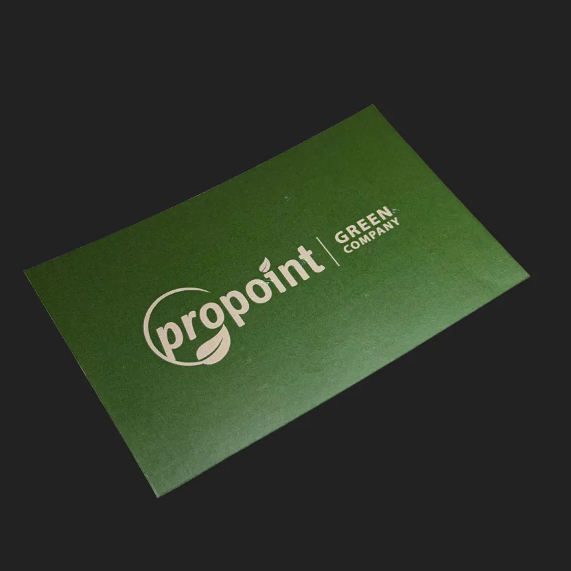
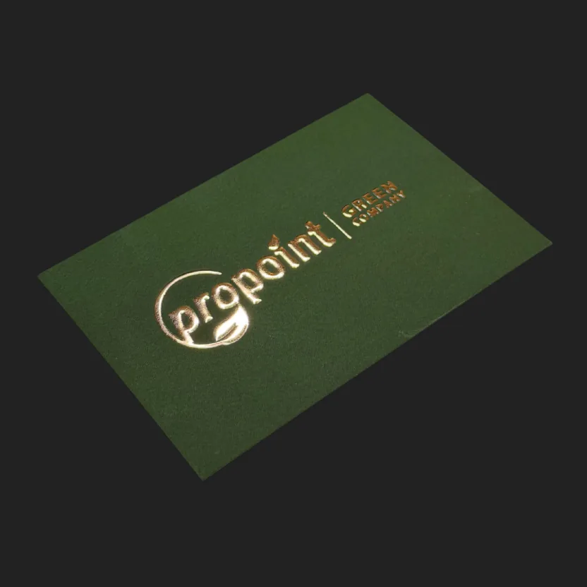
Thicker paper does not always mean a better product.
A heavier paper weight is often associated with quality and a premium look, but the best paper is not always the thickest.
For a product that needs to be easy to leaf through, fold or distribute, paper that is too thick can be impractical. For another product, such as a premium card, a cover or packaging, greater rigidity may be exactly what it needs.
That is why the choice of paper weight should be linked to the format, the construction, the way the product will be used and the impression we want to create, not just to the assumption that thicker means better quality.
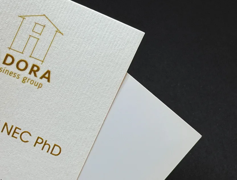
Smooth or textured surface?
The choice between smooth and textured paper affects not only how the printed product looks but also how it feels to the touch.
Smooth materials allow fine details and photographs to be reproduced precisely, while textured papers bring additional visual and tactile character. With these, the structure of the paper itself becomes part of the design.
That is why special and textured materials are often chosen for products where the paper needs to contribute to a sense of exclusivity and individuality.
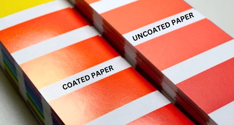
Coated or uncoated paper?
This difference affects not only the feel but also the way the printed colour looks.
Coated paper has a smoother, less absorbent surface. It allows sharp printing, crisp details and vivid reproduction of photographs and colours.
Uncoated paper has a more natural, more absorbent surface. The ink penetrates deeper into the structure of the paper, which is why the final look can be softer and more natural.
Neither is better in itself – the choice depends on the effect and the function that the finished product needs to have.
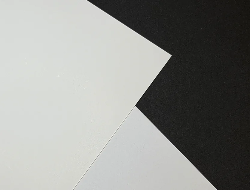
Paper affects colour too
The same colour does not look identical on every material.
The whiteness, structure and absorbency of the paper affect how intense, bright or saturated the colour will look. Even the same design, printed on two different papers, can make a different visual impression.
That is why the choice of paper should be considered as early as the design stage, especially when colour accuracy matters to the brand.
At Propoint, we see the choice of paper as part of the product as a whole. That is why, alongside printing, we help our clients choose a material that suits the design, the intended use, the production method and the desired final effect.