
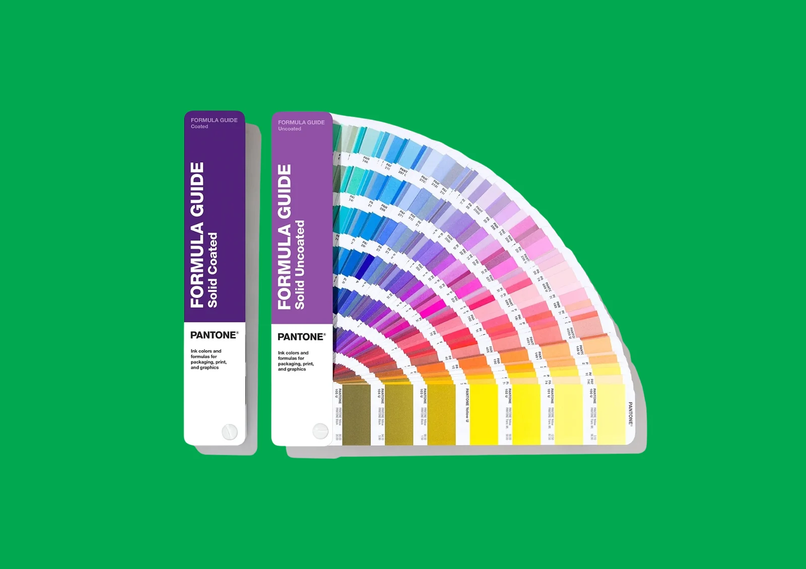
Precision and consistency in printing
When it comes to printing, colour is not just a visual element. It is an important part of a brand’s identity. But achieving exactly the same colour is not always straightforward. The result can vary depending on the printing technique, the material, the type of paper and the way the colour is defined.
That is precisely why the graphic arts industry uses the Pantone Matching System (PMS) – a standardised system that enables accurate colour reproduction.
What are Pantone colours?
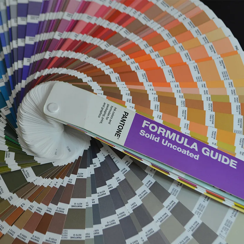
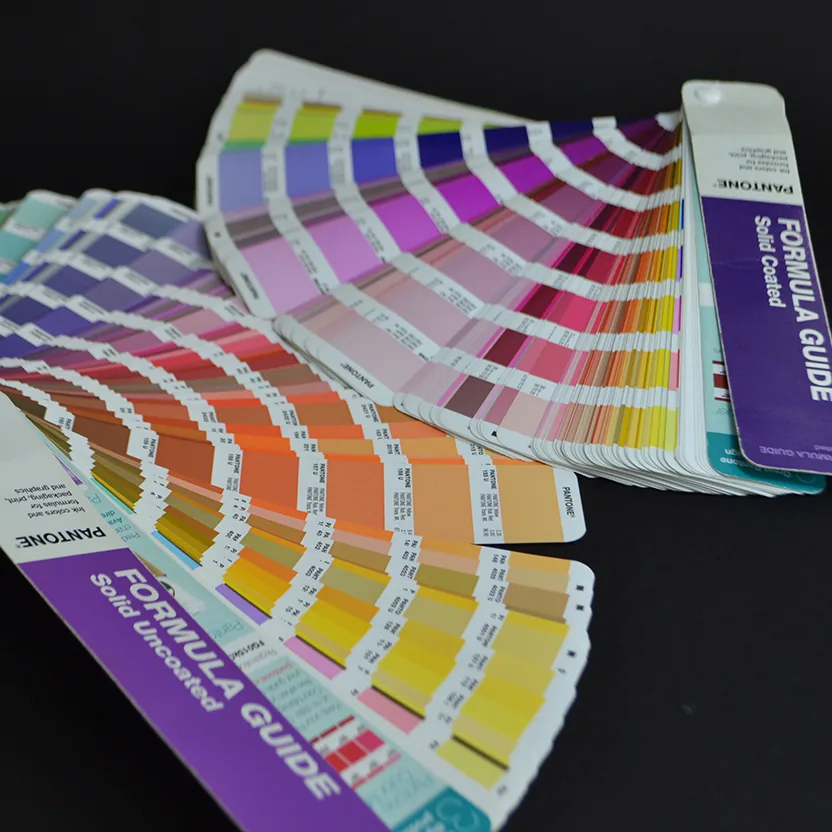
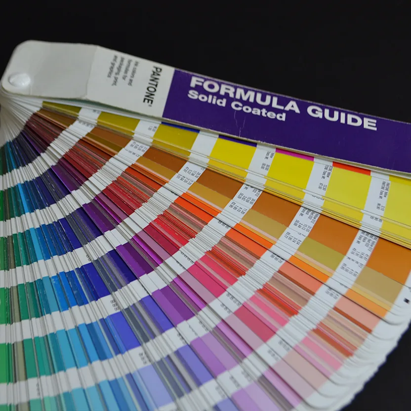
Pantone colours are part of a standardised system known as the Pantone Matching System (PMS), which serves as a universal ‘language’ for communicating colour between designers, printing houses and manufacturers.
Every colour in this system has its own unique code, which allows the same shade to be reproduced accurately, regardless of where and how it is printed.
This is especially important for logos and other recognisable brand elements, where even a slight change in shade can be noticeable.
How do Pantone colours work?
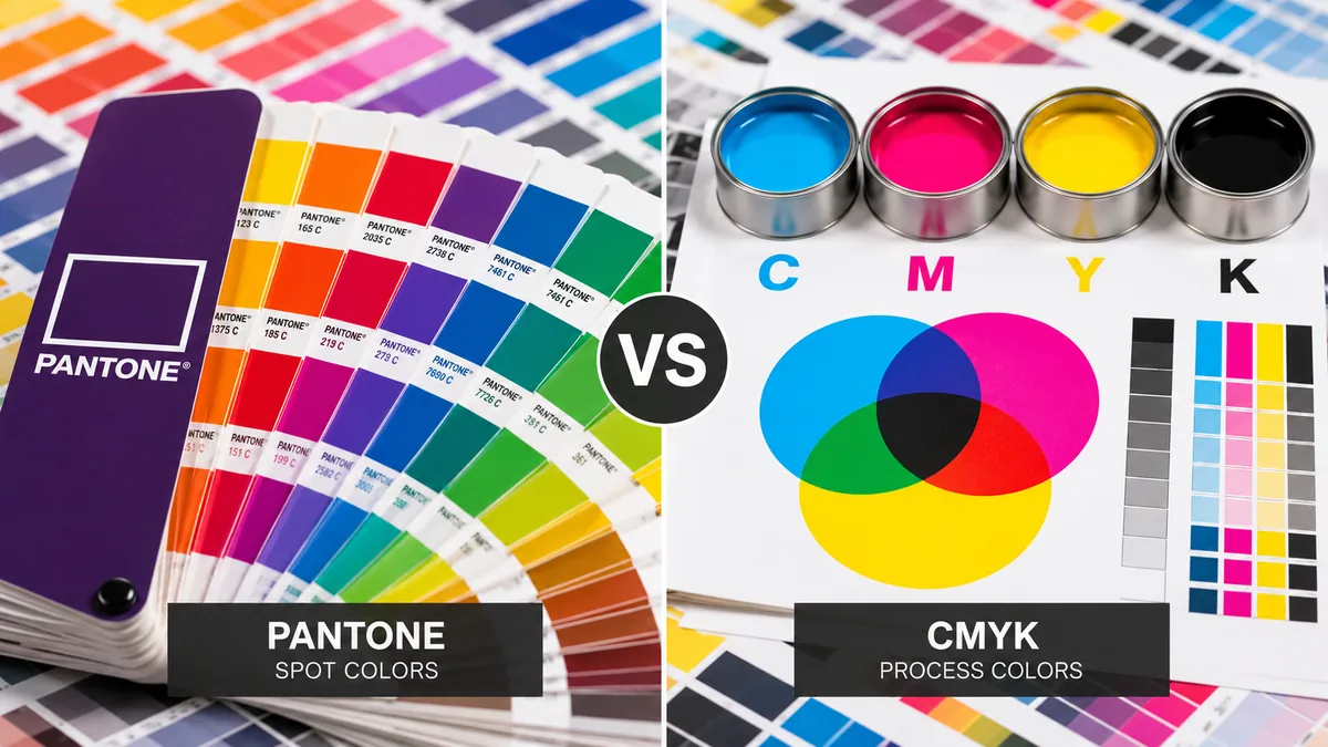
Unlike CMYK printing, where colours are built up from halftone dots of four process colours – cyan, magenta, yellow and black – Pantone colours are printed as specially prepared inks. As a result, certain shades can be cleaner, more intense and more saturated than their closest CMYK reproduction.
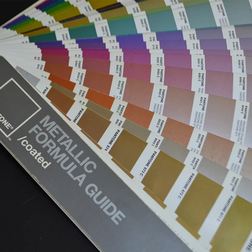
This is particularly noticeable with certain strong oranges, greens, blues and other intense shades, as well as with fluorescent and metallic colours.
The CMYK and Pantone colour systems can also be used together. For example, photographs can be printed in CMYK, while the logo or a signature corporate colour is printed as an additional Pantone colour.
The influence of the material
Even when a Pantone colour is used, its appearance can vary depending on the paper it is printed on. The same colour usually looks more intense and vibrant on coated paper, while on uncoated paper it can look softer and less saturated, because the ink behaves differently on the surface and penetrates further into the structure of the paper.
So when the aim is to make a colour look as similar as possible on coated and uncoated paper, you do not always have to use the same Pantone code. A different shade can be chosen that gives a visually closer result on the specific material.
When should you use Pantone colours?
Pantone colours are the best choice when:
- your brand colour must be 100% accurate
- you want maximum consistency
- you are using specific or unique shades that are difficult to achieve in CMYK
- special metallic or fluorescent colours are used
📩 Need help?
At Propoint, we will help you choose the right colour system for your project and ensure an accurate, professional print result.
👉 Contact us for advice or a quote.